3rd Round Prototype After Peer Review
Gaining perspective from colleagues is constructive for speedy, valuable improvements.
For the final task in DearlyCare’s design, I engaged five CareerFoundry peers on Slack in a structured feedback session. I shared my Figma link, enabling seamless collaboration and direct comments. Feedback markers are visible in the “Before” column on the left.
I analyzed and categorized the feedback into two groups, implementing selected changes documented on the following pages. This process refined my project and strengthened my ability to evaluate and apply constructive criticism effectively.
Introduction flow updates
from peer review
Explanation
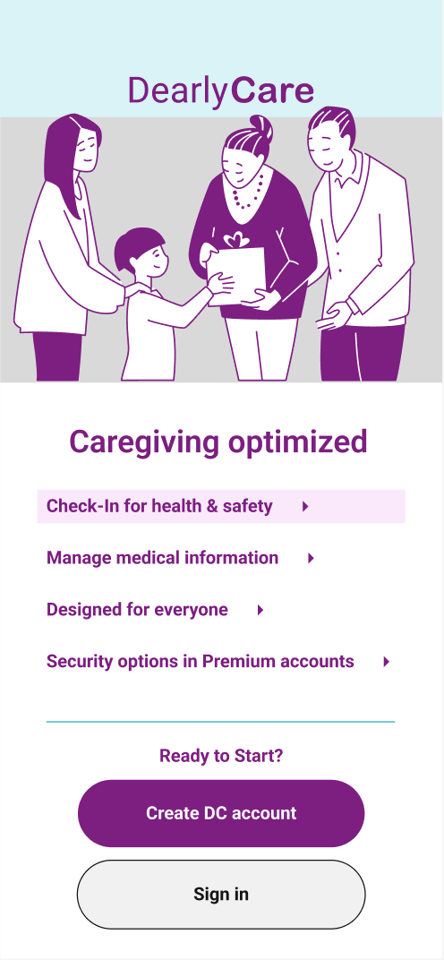
A key aspect of the DearlyCare concept is setting itself apart from other medical tracking apps, which can often be cumbersome and unclear about stakeholders.
Providing a functionality overview before requiring account creation helps build new user trust. The introduction features a click-through tutorial that previews upcoming steps and allows users to proceed at their own pace.
What has changed over time
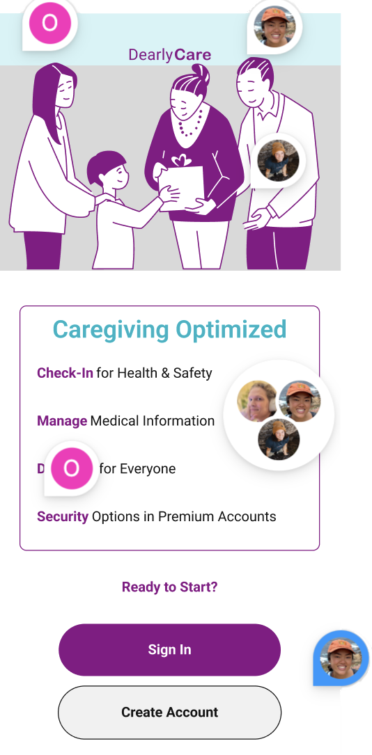
- Enhanced the Introduction menu design and typography to reduce confusion, adding arrow icons and hover effects.
- Relocated previous/next chevrons below the content for improved readability and development efficiency..
- Standardized the top navigation bar size and logo across DearlyCare to reinforce design hierarchy and brand identity.
- Users appreciated the thoughtful selection of SVGs to illustrate content effectively.
PEER COMMENTS
- Special small logo and nav bar seem squished – not like rest of app.
- Unclear that this is a menu to the onboarding section.
- Decrease padding in this section to create more space.
- Create Account should be on top because this is new user route.
AFTER
- Standardize navbar height across DearlyCare screens.
- Add hover action and arrows to identify link buttons as a clickable menu.
- Update hierarchy and define more actionable text for CTAs.
Onboarding flow updates
from peer review
Explanation
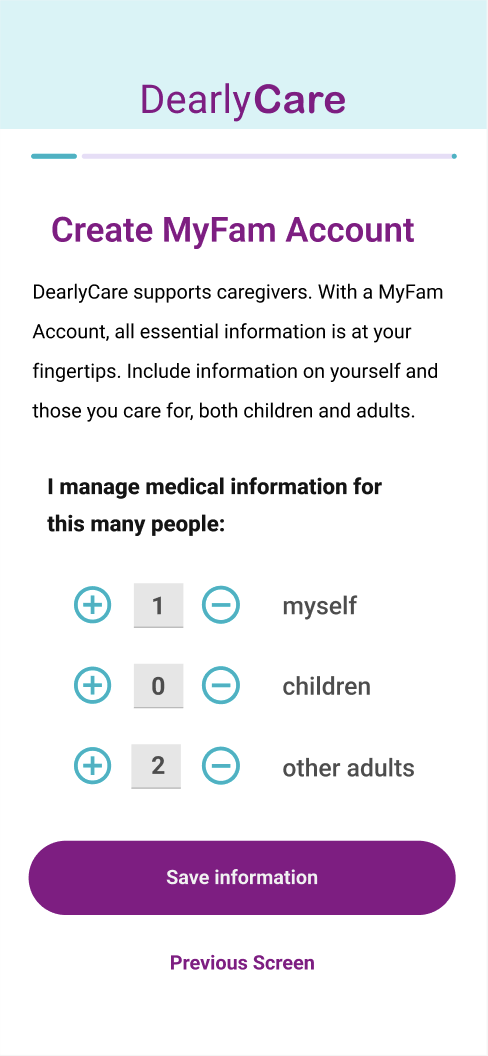
As a comprehensive family medical organizer, DearlyCare is very data-entry-heavy.
This first section of onboarding offers both easy data entry and opportunities to teach users about DearlyCare concepts of caregiving and care-receiving while giving users a chance to take a break from an instant crush of detailed data entry stress.
What has changed over time
- "For Caregivers" header banner was added on the first screen to indicate the type of account being used. The caregiver’s account was designed with significantly more data entry functionality, distinguishing it from the care receiver section.
- The CTA was placed under the content text to establish a clear page hierarchy.
- From this point forward, CTAs and screen titles were changed to sentence case for easier and more approachable reading.
- The size of the + and – icon buttons and the form was increased to improve accessibility.
- A status bar was added at the top of the screen to display progress in the Onboarding flow.


AFTER
- Removed greyed-out nav bar icons, matching left alignment becomes essential to page structure.
- Changed CTA to DC identity purple, moved it below content text.
PEER COMMENTS
- Greyed-out icons have no clear purpose, very confusing.
- Put CTA below content text.
- DC identity purple preferred over DC identity blue.
AFTER
- Content text reduced to allow larger logo and nav bar.
- Form icon buttons are larger and more clickable.
- CTA width and previous arrow removed for all onboarding flow screens.
PEER COMMENTS
- ( +, - ) buttons difficult to click on because of size.
- Increase width of CTA buttons to help with accessibility.
AFTER
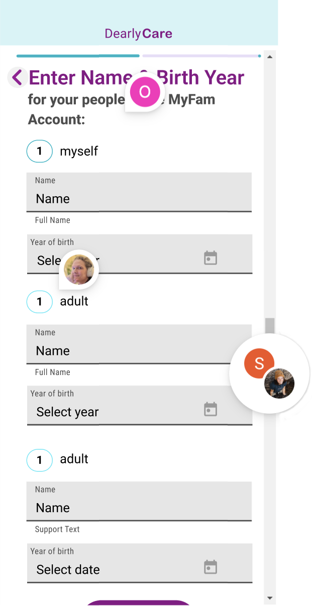
- Scrollbar indicators removed from screens that have vertical scrolling.
- “Myself” text font changed to extra bold.
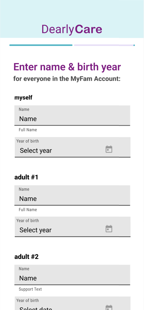
- Label changed to adult #1, etc.
PEER COMMENTS
- Scrollbars not needed.
- Number in circle confusing. “myself” type text not prominent enough.
- Change to 1. adult, 2. adult, instead for clarity.
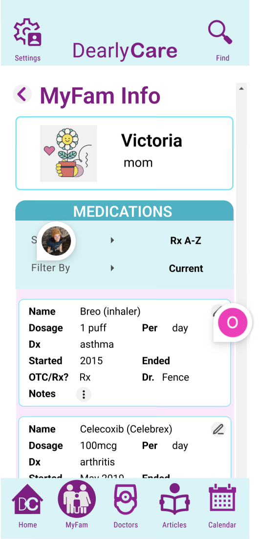
MyFam flow updates
aka retrieving medication list for mother user flow
Explanation
A caregiver can see all family members’ information starting here.
There is room for small, identifying images, but this is a largely text-heavy page. Lab tests, doctor's appointments, and other events can be scanned in the context of each person.
On the desktop view, caregivers can alter the screens’ appearance by using the left-side menu.
On mobile, the information is list-oriented, moving from left to right.
What has changed over time
- "This section was retitled MyFam (from Family Info) in response to usability participants' assertions that “chosen family and friends” be recognized.
- Altering the design to fit Material Design 3 components helped me hone the interaction design and tone-based surface color, which provided more background options for content.
- To make the content more discoverable, I created larger name CTAs at the beginning of the flow. I also used Flexbox functionality to move between mobile and desktop without creating multiple font sizes for titles and cards.

AFTER
- Colors simplified in hierarchy; Purple in title, blue in medication card header, no color background.
- Card icons now both in top right of card header.
- Medication information is now in one column – easier to read.
PEER COMMENTS
- Colors feel overwhelming here, not useful.
- Medication card text is not aligned, hard to read.

I didn’t share this MyFam desktop design with peers, but it was a valuable learning experience worth highlighting.
A key part of the assignment was adapting the design to Material Design 3 (MD3) components. While I didn’t keep all the changes, I gained an appreciation for MD3 concepts, especially canonical layouts like list-detail and feed.
This process also rekindled my front-end mindset, considering how Flexbox CSS enables smooth content adaptation across screens. For example, the results section shifts seamlessly from one column on mobile to two on desktop, without requiring font size changes.
