project case study
Peer review to obtain design improvements
For the final task in DearlyCare’s design, I engaged five CareerFoundry peers on Slack in a structured feedback session. I shared my Figma link, allowing for seamless collaboration and direct commenting. Feedback markers are visible in the “Before” column on the left.
I analyzed and categorized the feedback into two groups, implementing selected changes documented on the following pages. This process refined my project and strengthened my ability to evaluate and apply constructive criticism effectively.
Onboarding start: Improve typography and writing
A “For Caregivers” banner was added to the first screen to clarify the account type.
Since caregivers enter significantly more data, this helped differentiate their experience from that of care receivers.
CTAs and screen titles were also altered to sentence case to support readability and a more approachable tone.

PEER COMMENTS
- Greyed-out icons have no clear purpose, very confusing.
- Put CTA below content text.
- DC identity purple preferred over DC identity blue.

AFTER
- Removed greyed-out nav bar icons, matching left alignment becomes essential to page structure.
- Changed CTA to DC identity purple, moved it below content text.
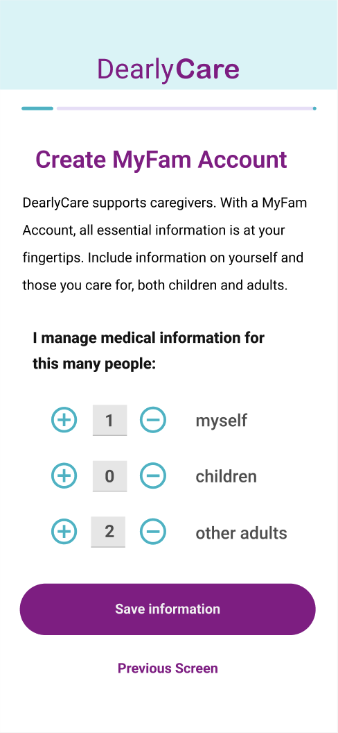
Begin information entry: Increase button size & add status bar
The size of the + and − icon buttons on the form were increased to improve accessibility.
A status bar was added at the top of the screen to display progress in the onboarding flow.

PEER COMMENTS
- ( +, - ) buttons difficult to click on because of size.
- Increase width of CTA buttons to help with accessibility.
AFTER
- Content text reduced to allow larger logo and nav bar.
- Form icon buttons are larger and more clickable.
- CTA width and previous arrow removed for all onboarding flow screens.
Entry forms need clear design decisions
To improve clarity, I added spacing and bold section headers to visually separate individual form areas.
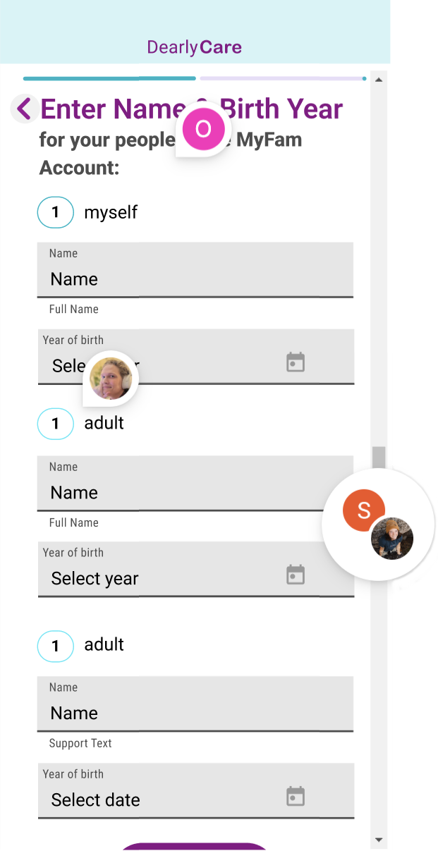
PEER COMMENTS
- Scrollbars not needed.
- Number in circle confusing. “myself” type text not prominent enough.
- Change to 1. adult, 2. adult, instead for clarity.
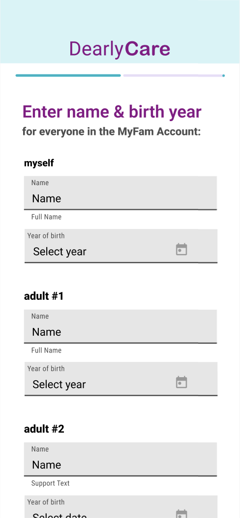
AFTER
- Scrollbar indicators removed from screens that have vertical scrolling.
- “Myself” text font changed to extra bold.
- Label changed to adult #1, etc.

Is Care Receiver Connect needed? Improve writing & checkbox size
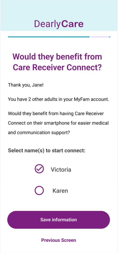
PEER COMMENTS
- Screen title is vague.
- Font size and checkbox size next to the name list is too small, hard to click which is an accessibility issue.
AFTER
- Screen title now more specific and instructional.
- Content text edited to improve understanding of the Care Receiver Connect.
- Font size and checkbox conforms to other design style decisions.
Onboarding final design


