2nd Round Prototype updates
Update #1 - Improve the app title
The previous app title, HealthAims, was an inadequate. 3 out of 6 participants did not recognize that the app was for caregivers, even when given explicit verbal and written prompts.
SUGGESTED CHANGES
After much consideration and business research, the name was changed to DearlyCare to reflect the importance of caregiver support in family networks.


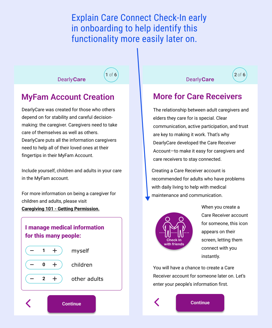
Update #2 - Use graphic hierarchy on home screens
- All participants needed to be guided to continue with the further caregiver onboarding called “Getting Started”.
- Multiple CTAs and illustrations confused the participants. They could not find the next onboarding steps on the caregiver's home screen.
SUGGESTED CHANGES
- One CTA button per page on the home screens.
- Add an Action Items section on the caregiver’s home screen to help with further onboarding.
- Reduce illustrations to a smaller size appropriate to the level of importance in onboarding and app learning.
- Add boldly colored subtitles to the home screens for the caregiver and the care receiver.


AFTER
- Bold colored banner identifies home screen for account.
- Empathetic quotation is emphasized.
- Action Items suggests next steps without being a blocker to user exploring.
- Illustrations resized to indicate place in the hierarchy.
BEFORE
- Visual hierarchy is confusing.
- Empathetic quotation is lost.
- Size of illustration distracts from logical next steps.
- Writing is not clear,instructional microcopy.
Update #3 - Refine UI and icons
- 3 out of 6 participants were confused by the “selected” state of the make a voice call button.
- Most participants had difficulty selecting the mother’s name in the Family Info flow
- All participants complained about the size of the icon label text.
- 4 out of 6 participants couldn’t identify the “Check-In” CTA button on the Care Receiver screen.
- 5 out of 6 participants needed help locating the Ask A Question function.
- None of the participants went back to the home screen by clicking the HealthAims logo, even though that’s a common way to navigate on e-commerce sites.
SUGGESTED CHANGES
- Standardize button state for icons
- Remove confusing buttons in user flows
- Increase the size of the icon and button label font
- Enlarge the size of the Check-In button on the Care Receiver screen.
- Select a new, more standard icon for the Ask-A-Question function. Label it as Find Help instead.
- Add a DearlyCare home button on the left for the bottom nav bar.


AFTER
- Find Help replaces confusing “Ask” icon with standard icon of magnifying glass.
- Illustrations resized to indicate place in the hierarchy.
- Check-In floating CTA enlarged and friendly icon added.
BEFORE
- Size of illustration and CTA distracts from logical next steps.
- Floating CTA for important care receiver Check-In feature is easily missed.
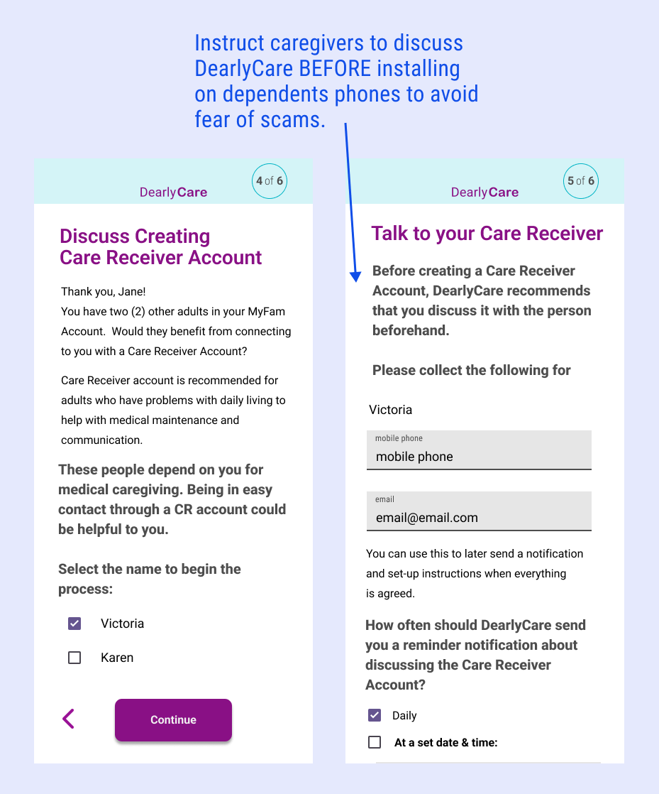
Update #4 - More approachable writing for onboarding flow
Every participant was leery of sending a direct message to their care receiver without first discussing it with them in person, by telephone, or by secure direct message. Their primary concerns were personal security and the avoidance of scams.
SUGGESTED CHANGES
- Improve the UX writing in the onboarding flow to be actionable, direct, and easy to understand.
- Restructure the onboarding flow to explain the care receiver functionality early.
- Stop the flow to await a further discussion between the caregiver and care receiver about DearlyCare.